Decoding matplotlib: How Patches, Polygons and BarContainer shape your Histograms
In this project, I used histograms to analyze text lengths in a hate speech dataset using LSTM models. By adjusting granularity and labeling individual bins, I discovered insightful trends in word counts, enhancing data interpretation. This article shares the visualization process, step-by-step code, and key findings, offering deeper insights into text distribution.
The other day, I was working on a small project of hate speech analysis in text using LSTM and, I wanted to understand generally how long the texts in my dataset are i.e. what is the general trend of the number of words in the text attribute.
I decided to use histogram to determine the same and found something insightful while coding that. This article is to share the same with you.
Histogram is a visual representation of the distribution of quantitative data.
Note: I have glossed over a lot of basics which you can get from multiple good materials out there. I have mentioned some of the good links in the references section at the end of the article.
A basic histogram is super easy to create (code given below).
- Import the required libraries and dataset. Drop unnecessary columns. Dataset can be downloaded from here .
import matplotlib.pyplot as plt
import numpy as np
import pandas as pd
df = pd.read_csv('english_dataset/english_dataset.tsv', sep='\t')
df.drop(['text_id','task_1','task_2', 'task_3'], axis=1, inplace=True)
- Plot the histogram.
plt.suptitle('Word Count Histogram')
plt.hist(df['text'].apply(lambda x: len(x.split())),
         color='blue',
         alpha=0.7, #transparency value
         rwidth=0.9,
         )
plt.xlabel('Word Count')
plt.ylabel('Frequency')
plt.show()

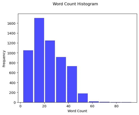
Now, this histogram is OK. We understand that most of the sentences have a word count anywhere between 0 to 20, But, it doesn’t tell us a lot about the distribution.
Making the histogram granular:
We need more granularity which we can achieve by increasing the number of bins to 50. Before we do that, lets understand the 3 main arguments that plt.hist accepts. This is going to be important for plotting our graph with deeper granularity.
- Input values: Array or sequence of arrays. In our case, we have used the array where every element at index i is the number of words in the i-th text entry of the column.
- Bins: Integer or array of integers. In our case, it’s an integer (50). We can have an array of integers when we want bins of varied lengths. For ex. [10,20,30,…]. Here, 1st bin would be of size 10, 2nd bin would be of size 20, and so on.
- Range: It sets the lower and upper limit to the range of bins. In our case, we can set the upper limit to 80 as we can see most of the frequency after 80, becomes negligibly low.
Let’s proceed with increasing the number of bins and labeling them.
plt.subplots(1,1,figsize=(15,5)) #Set the figure size to 15 in length and 5 in width
plt.suptitle('Word Count Histogram')
frequency,bin_edges,patches = plt.hist(df['text'].apply(lambda x: len(x.split())),
         bins=50,
         color='blue',
         alpha=0.7,
         rwidth=0.9,
         range=(0,80)
         )
plt.xticks(bin_edges.round(0), rotation=45, fontsize=7)
plt.bar_label(patches, fontsize=8)
plt.xlabel('Word Count')
plt.ylabel('Frequency')
plt.show()

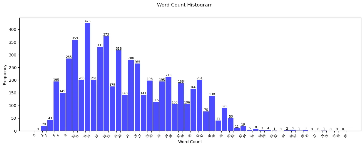
Now, this histogram looks much better and granular. This beautiful graph is populated after making the below changes apart from obviously, increasing the number of bins from default, 10 to 50:
- Increase granularity of x-axis: plt.xticks(bin_edges.round(0), rotation=45, fontsize=7): This lets us know more in detail about the word count trend. Just by seeing the graph, we can now confidently say that most of the sentences follow the word count of 10 to 22.
- Label individual bars: plt.bar_label(patches, fontsize=8): This is one of the most effective ways to help us determine the trend. Labeling the bins is always a good practice as it increases the readability and makes it more accessible.
Observation: We can reduce the range even further as most of the values after 70 are 0.
BarContainer, Patches, and Polygon:
All said and done, I know readers, that you are here for what the title says. We will dive into that now. matplotlib.hist() returns 3 objects.
n: By now, we know that this is nothing but frequency. It can be an array or a list of arrays of length equaling to number of bins, 50 in our case. If we are plotting multiple histograms on one graph, say comparing the word count distribution of several datasets then, frequency is a list of arrays.
bins: It is an array of length equaling to number_of_bins + 1. There is 1 bin extra to accommodate for the bin boundary. For example, w divide the data in 3bins then the array will have 4 elements: [bin1_left_edge, bin1_right_edge, bin2_right_edge, bin3_right_edge]
patches: Now, this is what you are really here for! Below is the excerpt from matplotlib’s documentation.
patches: BarContainer or list of a single Polygon or list of such objects.
Container of individual artists used to create the histogram or list of such containers if there are multiple input datasets.
Patches: Patches are the actual shapes that get returned by matplotlib.hist(). In our case, it’s the actual rectangles that made those blue bars. Reading the documentation though, patches can be a bar container, a list of single polygons and list of such objects. It is possible in the below 3 scenarios:
- BarContainer: If multiple histograms are overlaid on each other (say, we’re comparing different datasets), the patches are stored in a BarContainer. The BarContainer holds all the bars from each histogram.
- List of a single polygon: Suppose a scenario where nbins is 1 (I can’t think of a use case though). In that case, we have only 1 bin ie only 1 object. In this case, a single polygon is returned. One another use case is histtype-steps where a single stepped line is returned. We will look into it further below.
- List of such objects: This is our typical histogram where a list of rectangular bars (objects) are returned.
Histogram Type “step”:
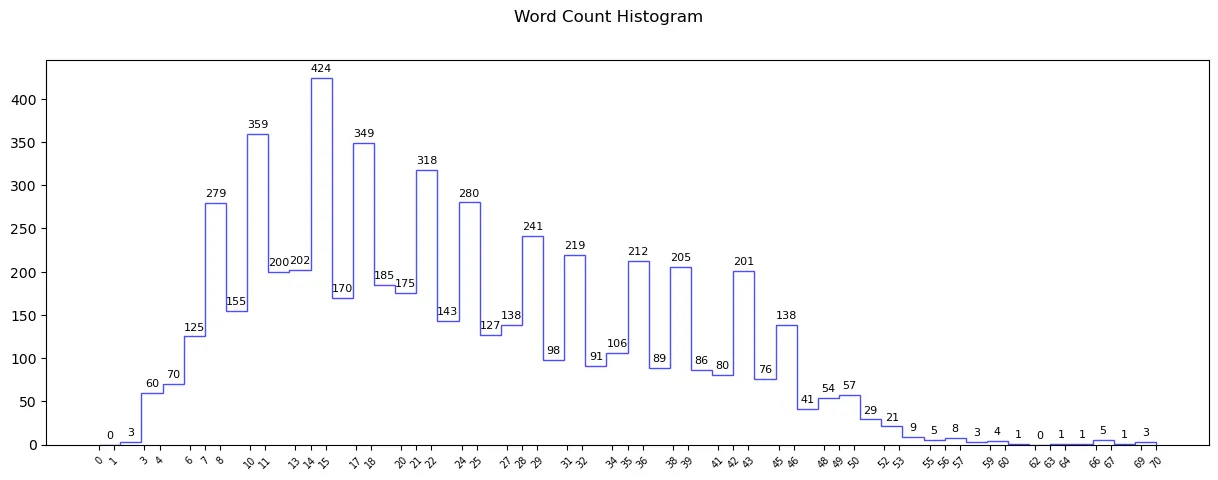
If we want the graph to be of type steps, then we can use histtype=”step” but, populating the labels here is a little more tricky. We As there is no definite bars, we can use plt.bar_label. We will have to manually label the steps in this case. Let’s see how to do this.
fig,ax = plt.subplots(1,1,figsize=(15,5)) #Set the figure size to 15 in length and 5 in width
plt.suptitle('Word Count Histogram')
frequency,bin_edges,patches = ax.hist(df['text'].apply(lambda x: len(x.split())),
         bins=50,
         color='blue',
         alpha=0.7,
         rwidth=0.9,
         range=(0,75),
         histtype='step'
         )
plt.xticks(bin_edges.round(0), rotation=45, fontsize=7)
for i in range(len(frequency)):
    bin_center = (bin_edges[i] + bin_edges[i+1]) / 2
    ax.text(bin_center, frequency[i]+5, str(int(frequency[i])), ha='center', va='bottom', fontsize=8)
plt.show()

Along with adding histtype as a step, a loop to label the steps has been added to the code. Let’s look into the loop. This part is visually explained in my YT video linked at the end of the article.
- Loop run: The loop runs from 0 to num_of_bin times as we have that many number of steps.
- Calculating the bin_center: (bin_edges[i] + bin_edges[i+1]) / 2: We would like to place the labels exactly in the middle of the steps ie bin_center which can be calculated as (bin_edge_left + bin_edge_right) / 2. bin_edge_right here is nothing but bin_edge_left of the next bin.
- Using ax.text to place the labels: The x-coordinate is nothing but the bin labels, the y-coordinate would be the height of the individual bin which is frequency and the actual label text would be frequency[I].
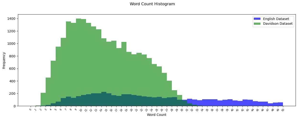
We come to the end of the article here. Before we go, here is a bonus code for showing overlapping histograms for 2 datasets.
Bonus multi-stacked histogram
Davidson dataset can be downloaded from here. I invite you to go through it and understand it yourselves!
df = pd.read_csv('english_dataset/english_dataset.tsv', sep='\t')
df.drop(['text_id','task_1','task_2', 'task_3'], axis=1, inplace=True)
df_2 = pd.read_csv('labeled_data.csv')
df_2.drop(['count','hate_speech','offensive_language', 'neither','class'], axis=1, inplace=True)
fig,ax = plt.subplots(1,1,figsize=(15,5))
plt.suptitle('Word Count Histogram')
frequency,bin_edges,patches = ax.hist(df['text'].apply(lambda x: len(x.split())),
         bins=50,
         color='blue',
         alpha=0.7,
         rwidth=0.9,
         range=(0,50),
         histtype='stepfilled',
         label='English Dataset',
         )
frequency1,bin_edges1,patches1 = ax.hist(df_2['tweet'].apply(lambda x: len(x.split())),
         bins=50,
         color='green',
         alpha=0.6,
         rwidth=0.9,
         range=(0,50),
         histtype='stepfilled',
         label='Davidson Dataset'
         )
plt.legend()
plt.xticks(bin_edges.round(0), rotation=45, fontsize=7)
plt.xlabel('Word Count')
plt.ylabel('Frequency')
plt.show()

Parting Thoughts:
Understanding how anything works at a deeper level be it histograms or ourselves, helps us unlock its full potential. I hope this article was insightful to you. The corresponding YouTube video is linked below, but indeed my skills lie better with writing. :-)
I wish you all the best for your endeavors!
Your support would mean the world to me. If you found the article interesting and want to see more, please follow me! You can buy me a coffee too to encourage me to keep going!
Thank You for your time and patience!
